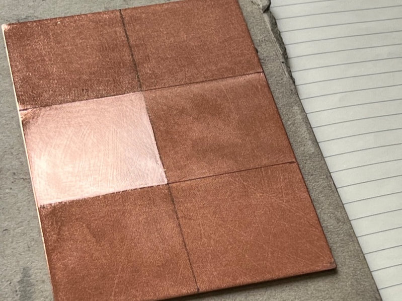
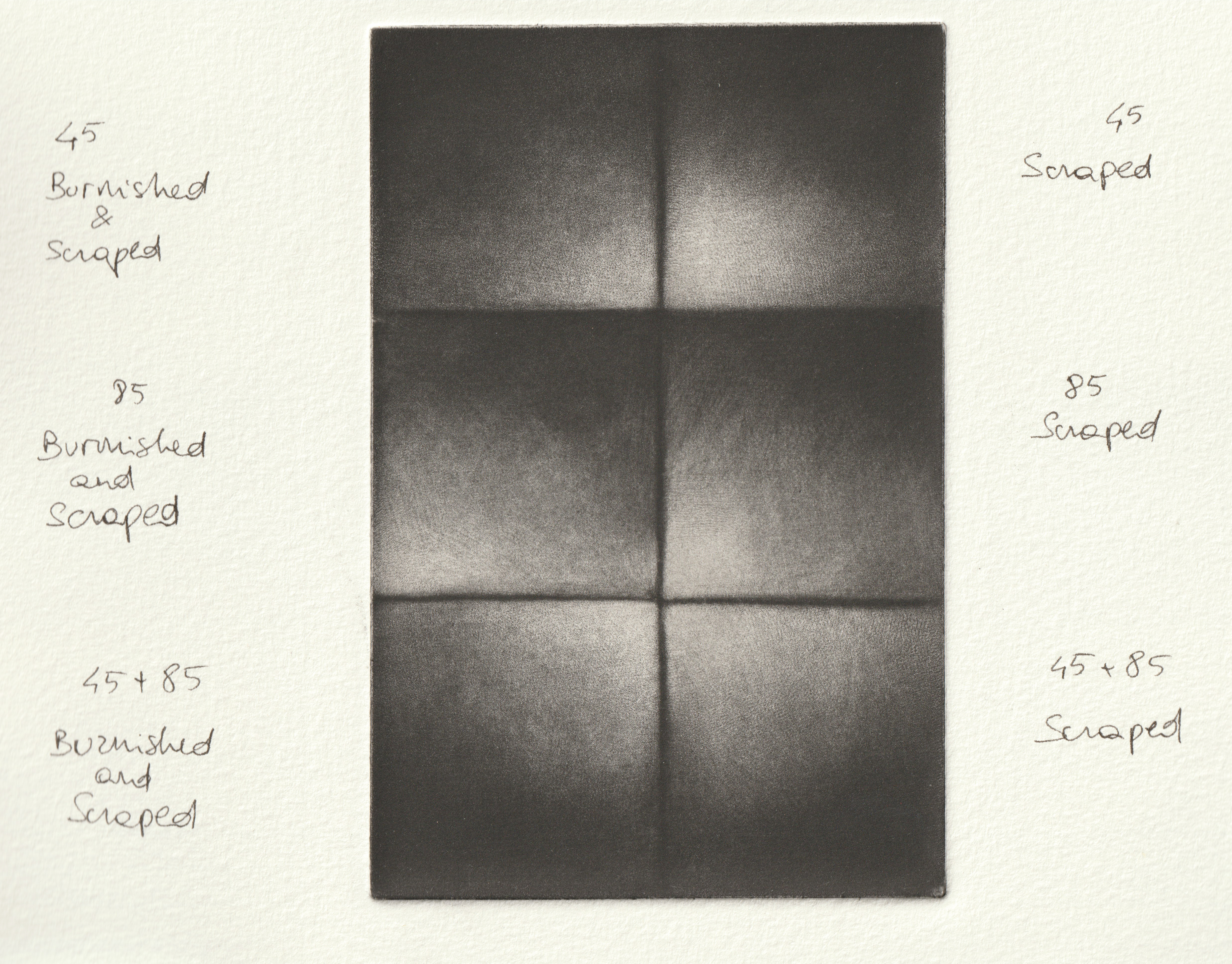
 In my quest for a deeper understanding of mezzotint and which techniques or materials are useful for my practice I recently made a test plate. It's something I should have done before: a bit of a nerdy investigation that might only be of interest to few people as the difference is quite subtle. Anyway, fellow mezzotinters, here it is. I took a 15x10 copper plate and rocked it as such: the top third is rocked with a 45 gauge rocker (36 passes), the middle one with an 85 gauge (32 passes) and the bottom with both (22 passes 85 followed by 10 passes 45). For each area I proceeded to either just scrape or scrape and burnish a 5cm square. Working a gradation into the middle area (gauge 85) took around 50 minutes for each square. Scraper marks were immediately visible and appear on the print too. On the right handside square I scraped starting on the dark corner but burnished starting on the light corner. I tried, but found I definetely prefer working from light to dark, insisting on the lighter areas. Scraping each square in the bottom area (45 and 85 gauge) took about 55 minutes each, working from light to dark. One can feel the coarser surface under the blade. The top area (45 gauge) is the most satisfying to work on: one is really shaving that copper. The scraping took longer, about 1 hour and ten minutes, while scraping and burnishing took a little less. Conclusions The ultimate reason to test for me was to understand which combination would give me most grain as this is what I like for my work. By grain I mean visible dots and little marks on the lighter areas of the print rather than evenly gray areas, which might be what other artists are after. There is a substantial difference in how the surface feels like while working. Because the 85 ultimately gives a more shallow ground, any tool affects it immediately. So if one advantage of a finer gauge is that it is way faster to rock and to scrape, getting a very smooth transition without scraper or burnisher marks requires a very gentle hand. Even with the 85 there definetely is some grain and the dots are visible, particularly with a careful ink wiping. The 45 and 45+85 areas feel way more resilient. The timing increases but the texture on the surface is deliciously uneven. It is way easier to obtain a smooth gradation and obliterate the marks of the tools, even if I don't mind when my prints are showing a little hatching. Shifting from scraping to burnishing about a third of the way in is something I will definetely do in the next prints. This is one of the cases where being a painter had influenced my way of working: I thought that the circular motion of the burnisher would be akin to "blending" and that it would smooth the surface and in fact get rid of the grain. Not so! I read about this in Carol Wax's book but I had to see it to believe it! For sure these results are also to be considered in relationship witht the size of a plate. Ultimately if I have to work on a small plate I would definetely use the 85 as the difference between the different tools would be too subtle to appreciate. Medium size will be a combination of 45 and 85 at different rates, depending on the subject. Until now I only ever did a very large size plate ( 50x70cm, 85 gauge) and it took me about four months! At that size I would only consider working with an 85 gauge as I am not a masochist! Another outcome is that I now have a test plate for inks and papers, so I tried an Arches paper too. There's an image of the printed plate here but you can download a full resolution file below to see for yourself. Please let me kow if you have any comment. 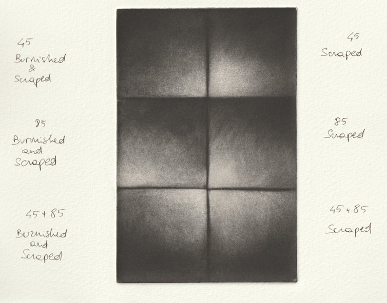
0 Comments
 What are the most common mistakes ( and how to correct them)? The most common mistake while working on a plate is too much scraping: either an area has become lighter than intended, or perhaps one has scraped an area that was supposed to be black. If the area is small, the plate can be carefully rocked again with a small rocker and it won't be too difficult to make some minor changes. When this is not possible, another solution is to tap a drypoint needle and make some dots that will blend in with the exisiting marks: this will make the area darker, once printed. Another common mistake is to wipe the plate too vigorously while printing. It is important to understand that although mezzotint is an intaglio technique, weirdly a mezzotint plate is similar to a relief matrix: the lightest parts have been scraped so are a little lower than the dark parts. For this reason wiping should be done really gently or the dark grays will fade. I use a dirty tarlatan in circular movements for the first step lightly pushing the ink in, then as the image becomes visible I wipe with a cleaner tarlatan in swiping movements, and finally I do quite a lot of wiping with the palm of my hand, concentrating on the light areas and wiping in the direction of the dark ones. 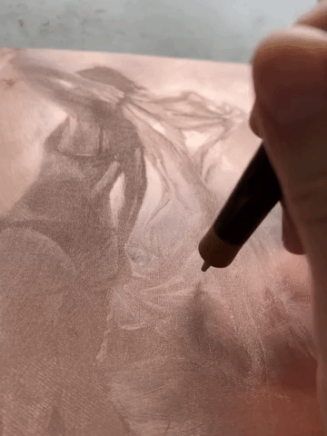 How much do you plan before starting a work on a new plate ? A mezzotint requires a time investment so it is good to be confident about the strength of the composition. Before embarking on a new print, once I have found an interesting subject, I think about the concept of Notan, a Japanese word that defines the balance between dark and lights: I generally work from a drawing or a photographic reference, carefully considering the tonal distribution. These are some of the questions I ask myself before the start: Are there geometrical shapes I can enhance? What is going on on the diagonals ? How and where do I place some points of interest ? Which edges will I leave soft and which should be hard ? Is there an area that I want almost white ? Now, a mezzotint plate is like a ticking bomb: one can’t pull a lof of proofs because they might indent the number of prints available for the edition. I only proof the plate when I think I am very close to finishing. The first print is generally the result of the decisions taken during the planning fase, but it won't be exactly as expected. At this point it is important to look at the first proof without "preconceptions". I always try to give myself a little time before I rush to do more work on the plate: I leave it and look at it again the next day. Does the proof suggest a different path ? I am always open to alter my original idea. What other printmaking techniques can you combine with mezzotint ? A rocker, used as a drypoint tool, can make interesting marks on etchings, drypoints or aquatints. I personally haven’t tried but I see fellow printmakers using a burin, hard-ground or soft-ground etching to include some line work before rocking the plate. Right now I am experimenting with Chine Collè and I think that too could be interesting, particularly as a way of introducing some flat, intense colour or altering the tone of the paper. I don’t do multiple-plate coloured prints or ink the plate à la poupée because I don’t feel the need for it. I find that black and white is very powerful and I still haven't found a good reason to give that up. 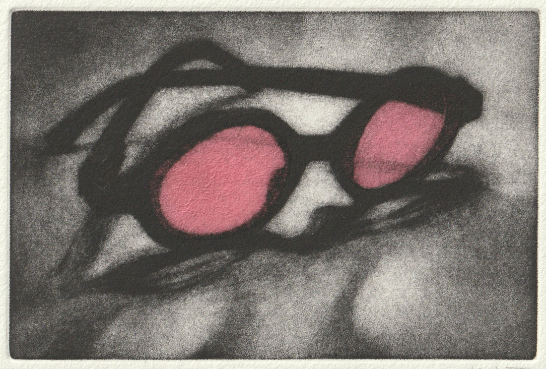 What, aside from the intensity of black and a the gradation of shadows are the generic “pros” and “cons” of mezzotint ? I will start with what mezzo can’t do: it is not a dynamic technique: it doesn’t allow you to draw on the plate with a sweeping, vigorous, idiosyncratic mark. If you look at a square centimeter of a Rembrandt or a Goya etching, you immediately recognise the artist by the peculiarity of the markmaking. This doesn’t really happen in mezzotint: the focus is on the image and how it is filtered through the artist’s vision. There’s also of course an issue with the size of the work, which is limited compared to other intaglio techniques. What is unique to mezzo is its pure tonal nature, which I find incredible for creating a pictorial space, an infinite space into the confined edges of a plate. Also mezzo has a vast range of grays and the chance of controlling edges, compared with another tonal technique such as acquatint, for example. I was recently interviewed for a podcast in Italian ( out soon) and I thought I could write down my questions and answers for English speakers. How much time does it take to prepare a plate ? This is always the first question I get but I feel it is not much of an issue. Mezzotint is well known for taking a long time but egg tempera or photorealism in oils too are laborious techniques. Making a mezzotint shouldn't be presented as an heroic endeavour: yes, rocking a plate is a zen practice but you can also be more prosaic and catch up with the latest Netflix series ! So my answer is simply that it takes the time it takes, and I enjoy every minute of it ! For those who want numbers, rocking a 20x25 cm plate takes about four hours with a pole rocker ( see below).  What do you use to rock your plates ? I rock my plates with two different rockers. I have a large 85 gauge (gauge means teeth per inch) rocker that does most of the work. I do about 30 passes with that one, in every direction. I then rock a dozen passes with a 45 gauge rocker. The pits that the 45 rocker makes are deep, hence the plate will yield more grays. Imagine a gray scale from black to white: you get more “stops” when you work with a lower gauge count. If used on its own the 45 rocker would need way more passes to rock the plate properly, and it's not a good choice if you want very fine details. By using two rockers I find that the surface is not as regular, once printed: dots and lines from rocking remain visible. This is what I want for my prints, but maybe it's not to everyone's taste. How do you avoid injuries when preparing the plate ? The game changer is my pole rocker ! Not only it makes rocking easier but also quicker by about a third. I strongly recommend the one engineered and produced by the french artist Remy Joffrion as it is very versatile. The end of the pole is mounted on a tripod so it can be easily moved around and adapted to any table. There are two different ways of placing the hand while rocking and it works with both hands. Remy has even tested it with the help of a physiotherapist to improve the ergonomics. It is also important to take frequent breaks while working to relax your arms and shoulders. (note: Remy’s website is a little outdated, no web shop. You need to email Remy to arrange a purchase. The price is about 280€ + P&P: worth every penny !) 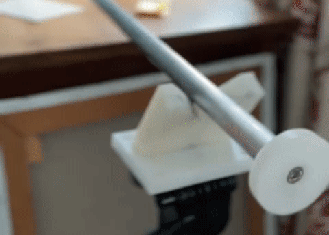 How often do you sharpen your rocker ? I sharpen it whenever I start a new plate. If the plate is more than 15x10 cm I might sharpen it again half way through. I use a round sharpening stone with a few drops of water rather than oil. I also use a sharpening jig that keeps the angle of the blade constant. Julie Niskanen, who makes the jigs, has a "how to" video here. How do you bevel the plate ? Before I start rocking the plate I use one of my bevelling tools: I have one from Matthieu Coulanges (his tools are beautiful ! In time I built a collection of them) and one from Arteina. Once the plate is rocked I do a little more bevelling, then I file the corners with a fine jeweller file and finally I polish the sides with a burnisher. I recently found that the ceramic sharpener I use for my scraper also works as a file/burnisher for bevelling. Printing a mezzotint plate is not the easiest thing: it took me a while to understand how to obtain the result I wanted, through trial and error (I've had very little printing tuition). I got some great tips from Mezzotint Essentials by Robert De Groff, a book I strongly recommend. What I understood is that the most common mistake is to overwipe the plate, but let's start from the beginning. My favourite paper is Hahnemuehle, and I use Charbonnel 55981 ink softened with a little plate oil, so that the consistency is a little runny. Aside from when I am printing a proof, I always prepare the paper making a damp pack two days ahead of a printing session: I quickly pass the sheets of paper under a tap, then let them drip the excess water and store them in a plastic sleeve inside a bin bag, then I leave it under a board with a book on top. If done well, there is no need to blot the paper before printing: it will be damp but not shiny ( if shiny, it does need blotting before it's used). 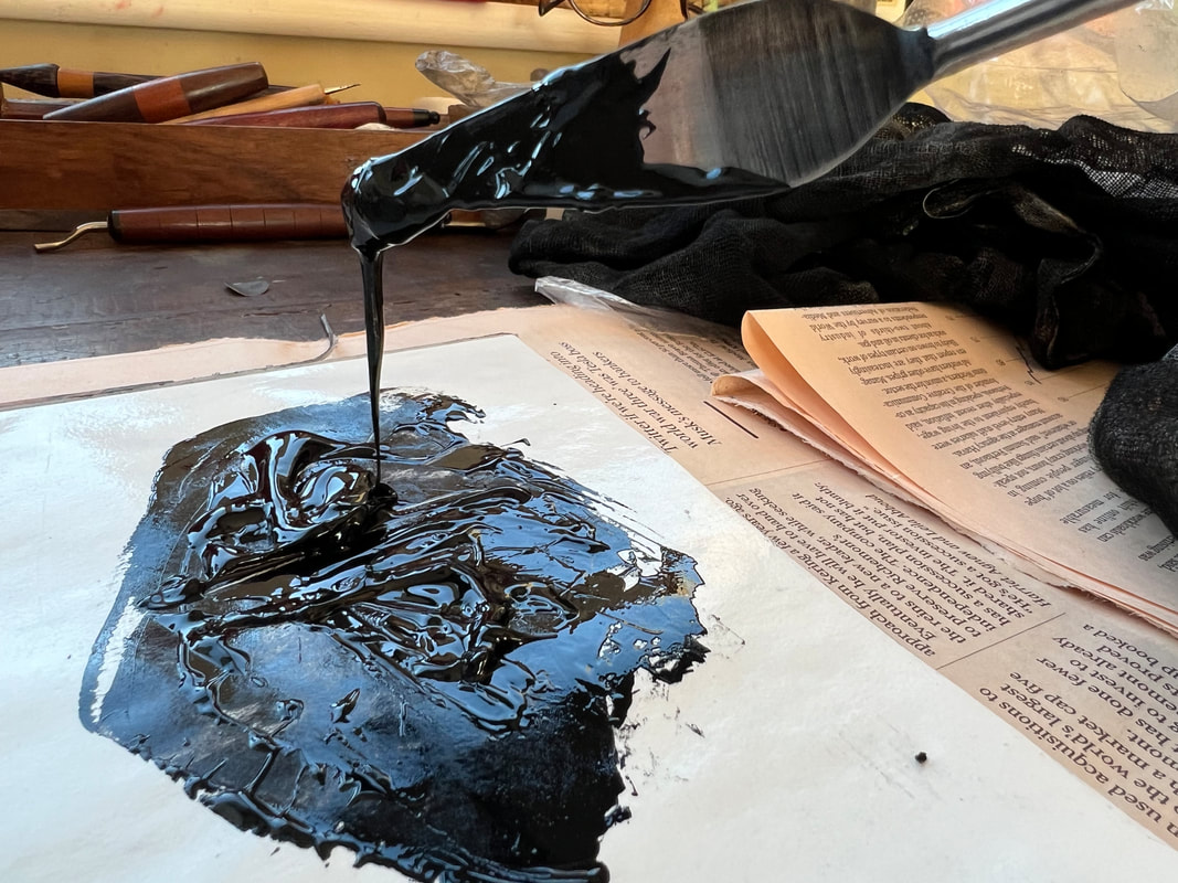 The ink should flow from the palette knife. The ink should flow from the palette knife. I use a disposable palette for mixing ink and a bit of cardboard for spreading it, so there's less cleaning afterwards. I also use clear plastic gloves for handling the plate and a different pair of gloves for handling the paper: no need of scrubbing the hands clean for every print. Something else to prepare beforehand is the registration sheet. Somehow the bottom of my plate is always filthy ! I draw the placement of plate and paper onto a larger piece of paper that I place on the bed of the press, then on top of it I put on a piece of clear acetate that I can wipe clean after each print. This is convenient when I am printing different plates, so I just slide a different registration sheet for each size of plate under the acetate. 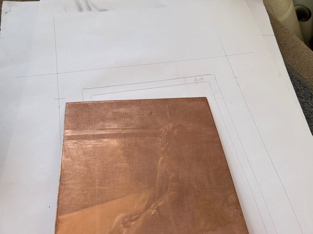 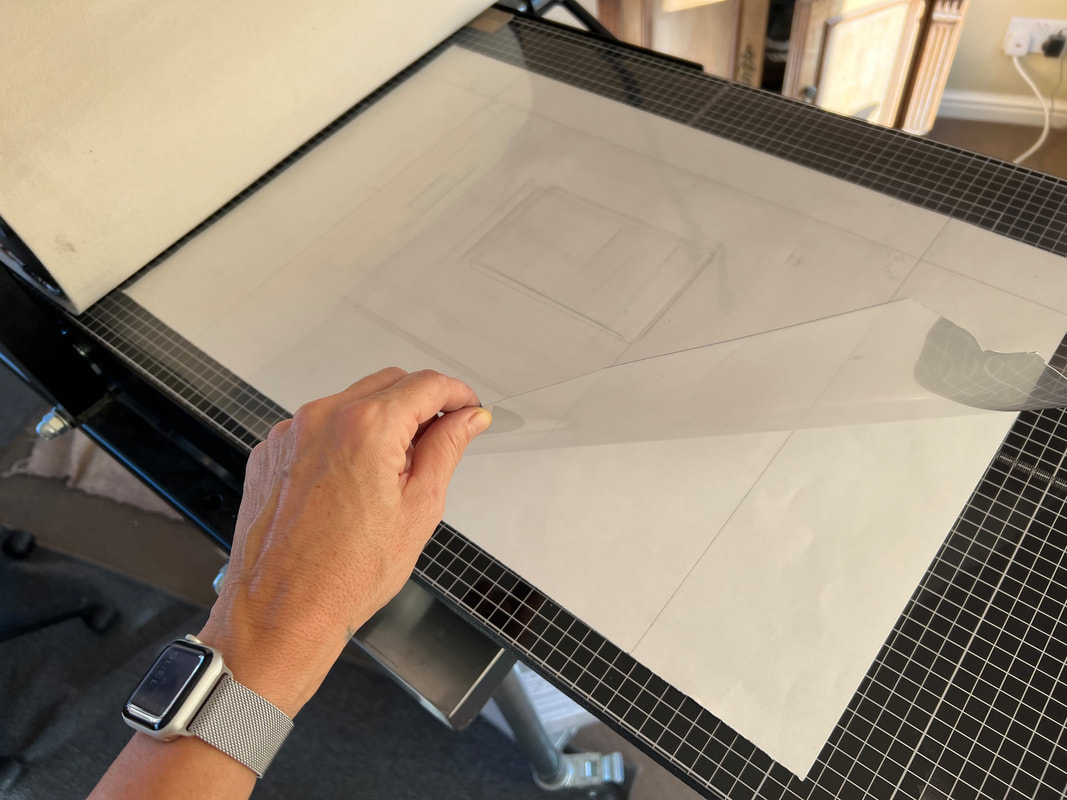 I don't own a professional hot plate: this is my low tech plate warmer. The plate should not be too hot that you can't even hold it, just warm. Once the surface is covered with ink I start wiping with a circular motion with the classic ball of tarlatan, and when the image appears I change motion to a swipe. As soon as the bulk of the ink has been removed, I take my gloves off and finish wiping with the palm of my hand, gently stroking the plate and wiping a little more with my fingers in the lighter areas. I don't use any chalk powder on my hand, I just wipe it on the apron before and between passes. 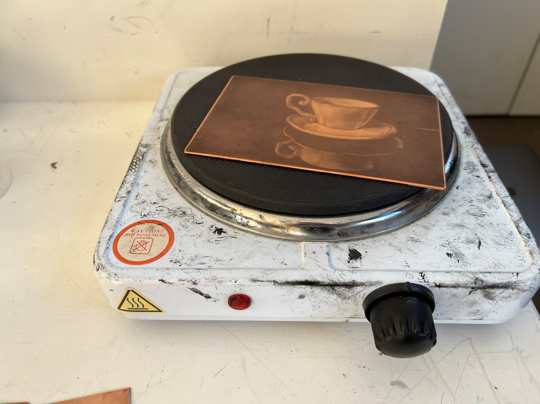 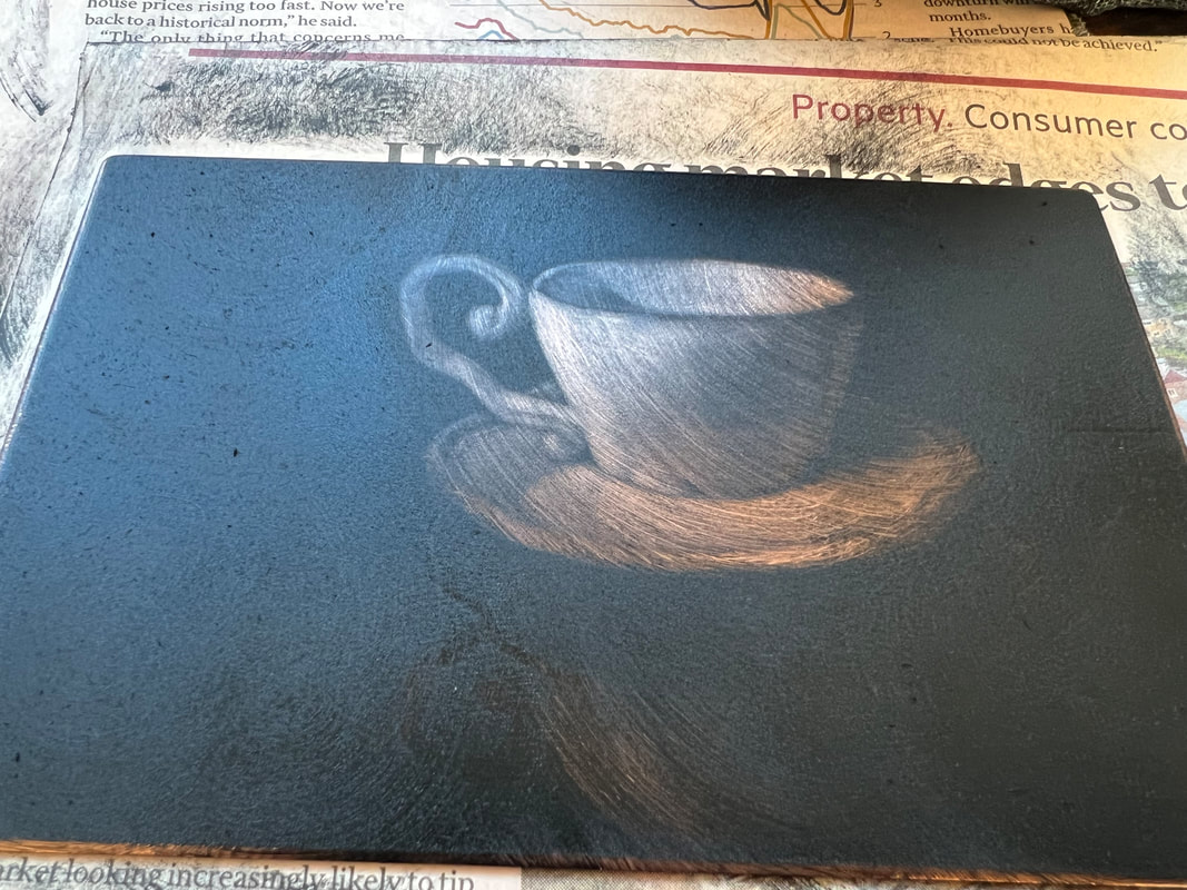 The plate after wiping with a vigorous circular motion. I then wipe lightly from side to side with a cleaner tarlatan and finish wiping by hand. I clean the sides of the plate with a piece of cloth on which I spilt a few drops of alcohol then place the plate on the press bed. I then wear the clean printing gloves and carefully place the paper over the plate, then a piece of tissue paper on top as well as an extra piece of felt to add pressure. I have two blankets in the press, a light swanskin and a medium felt. I set my press tight: it's not a geared one, so I use all of my body to turn the wheel. 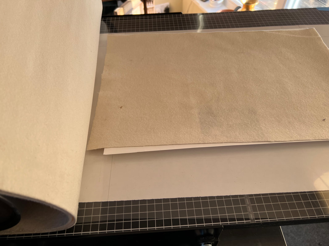 The printing sandwich: registration sheet, acetate, plate, Hahnemuehle paper, tissue paper, felt. And voila. The prints go in between cardboards and under a pile of books for a couple of days so that they dry flat. After printing I clean my plates sprinkling Zest It (citrus solvent) and brushing with a soft toothbrush and again with alcohol ( methilated spirit).
Oh, and I was forgetting the most important advice: give it a day ! Or at least a couple of hours. If you are printing the first proof, don't rush to clean the plate and start scraping everywhere again. A print always holds an element of surprise when we lift the paper off: allow the first proof to "sink in" and see if maybe it might suggest a slightly different direction,or level of finish. Maybe some precise detail is not needed, or the scene needs a little murkiness, less contrast, softer edges. Look at the proof with fresh eyes and be open to change your original plan. What is mezzotint ? Mezzotint is a printmaking technique where the surface of a copper plate is worked with special tools in order to produce an image. The technique is part of a family of techniques called intaglio, where once the plate (matrix) is ready for printing and ink is applied, the ink will sit in grooves and pits lower than the surface of the plate. A mezzotint is an original print: this means that the print is not a reproduction of another existing artwork, like a digital print would be a photocopy of a drawing or painting for example, but is an original in itself. Original prints may be part of an edition; in the case of a mezzotint the edition generally is made of only a few dozens as the copper plate degrades after a certain number of impressions. Some mezzotints have larger edition because the artist has had the plate steelfaced ( plated with a thin layer of steel) which makes it harder hence more durable.  The characteristic of mezzotint is that it is a tonal technique ( no lines !): the image is created by producing black, gray and white areas, and it is possible to obtain some very smooth transitions between these different shades. Mezzotint, also called maniera nera in Italian, manière noire in French and manera negra in Spanish, is well known for producing the richest and darkest black of all the intaglio techniques.
Mezzotint is a very laborious process as it needs a long preparation before the artist can even start working on the image. The plate needs to be roughened up with a special tool, called a rocker, that indents the surface with thousands and thousands of small pits that will later function as receptacles for ink. This preparation takes many hours, depending on the size of the plate. Once the surface is ready, in order to produce an image the artist has to scrape with a blade or smooth the metal with a burnisher so that the pits become more shallow (and will produce grays once printed) or disappear altogether ( for whites). This too is a lengthy process. Once the artist is happy with the image on the plate, it is time for printing it on paper. The plate is covered in creamy ink, which is then carefully wiped with a gauzy cloth and with the palm of the hand so that the excess is removed and the ink is only left in the pits. The plate is then placed flat on the bed of a printing press with a sheet of damp paper on top and as they pass under the roll the ink is transferred from the plate to the paper: the image finally appears in black and white. I am very excited to finally share with you a project that I have been working on these past weeks. You might already know how, as a EU citizen, I found the UK political situation of the past three years quite upsetting. As the uncertainty was coming to an unescapable end I set out to make my first artist book as a personal response to events. The book features five of my mezzotint engravings and it's made completely by hand in an edition of 4. Here below is a short video filmed by Alberto Lais. Hortus was conceived as a small Herbarium of Mediterranean plants that I collected on my street. They make the street more beautiful and diverse, and particularly the large olive trees have surprised me for how well they adapted to this colder ( less so now perhaps) climate. The parallel with my own life was obvious and it sparked a series of mezzotint engravings that I titled Immigrant Plants. The idea of collecting these in an artist book came when I learned of a herbarium put together by my ancestor, the pharmacist and botanist Stefano Rosselli, in 1575. I wrote about this extraordinary object here.
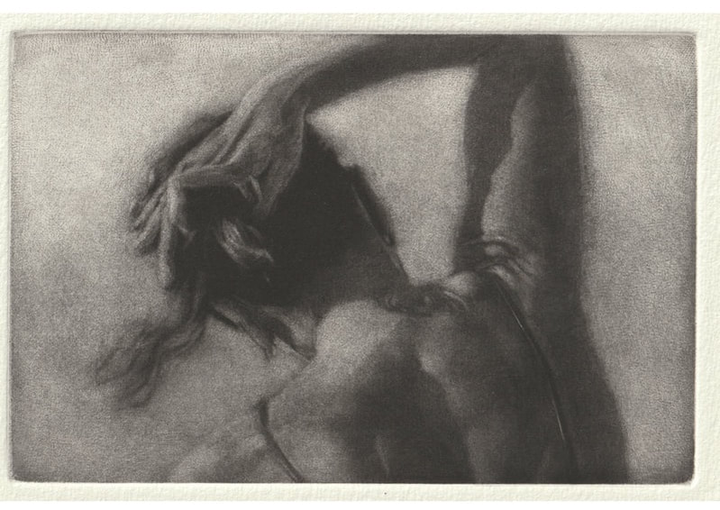
I am pretty stubborn and I wanted to make the book on my own, so I set up some sessions with book artist Mark Cockram. He showed me how to bind the pages, set movable types for the letterpress text, and how to make a box, then sent me home to work. The books, an edition of 4 completed on the 31st of January, turned out exactly how I envisioned them ! Here's a breakdown of the process. Because of the time scale involved in the work, most mezzotints are relatively small. Mezzotint plates can be bought ready-made, but I find the process of preparing a plate very rewarding and ritualistic, and this ultimately somehow adds to the poignancy of the image.  At the start the copper plate's surface is completely smooth. Preparing it for a mezzotint means roughening it up so that it will feel like very coarse sandpaper. 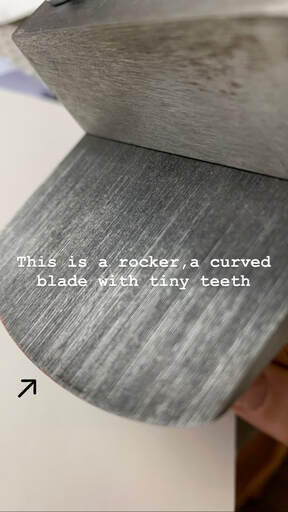 The tool used for this work is a rocker: a metal blade that looks a bit like a herb chopper, but with tiny teeth, like a comb. Rockers exist in different sizes and also with different teeth "density": the most commonly used have a "teeth count" from 65 up to 100. I have a 45 and an 85. The lower the count, the more it takes to prepare the plate but also the more shades of gray one can achieve, because the pits it will form on the surface are deeper. The rocker needs to be sharpened regularly while preparing a plate, another skill I had to learn for this technique. My rockers are mounted on a jig or a pole rocker to help me achieve a regular movement and protect me from excessive strain during the lengthy preparation. It is still a repetitive movement that ends up hurting my joints so I can't do more than a couple of hours at the time. 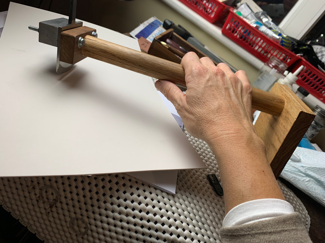 Here below is the actual rocking of the plate: The blade is gently rocked sideways and it slowly "advances" on the plate, leaving behind a series of microdotted lines. The plate is then rotated by a few degrees and the process repeated so that after the many passes (I do 40 to 50 passes) required to complete the preparation the surface is completely rough and lines are no longer visible. The plate is now ready. Should it be inked and printed at this point it would result in a black rectangle. It is time to start scraping the lights out. I draw the image on the plate in pencil and start working on making the surface smoother in the areas that will be lighter. The lights are buildt slowly and the darks are carefully preserved. The scraping movements are short and sharp in details while longer strokes are used for larger areas. Scraping produces some copper dust as it effectively removes a thin layer of metal at each stroke. While I work I use a softbox light to avoid strong refraction on the plate. Here below is an image of the print obtained from this plate, regrettably the photo does not convey how velvety the print looks on paper ! 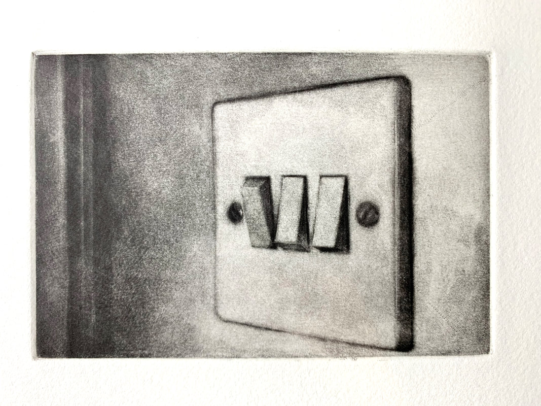
A few years ago he published a very entertaining and pleasant book, Il Museo Immaginato, where he plays at designing an ideal museum where he can hang any work of art. The virtual institution about which he fantasizes in the book, that would be designed like a house and include a kitchen ( with works by Zurbaran, Cotan, Campi, Rembrandt ), a cellar ( Velasquez, who else?), a dining room with paintings by Veronese, and so on. Do you want to appear as scholarly snob as Mr Daverio in his trademark bowtie? Clearly indicate your belonging to continental culture ? Here are some expressions I picked up in the book that you can carelessly drop in your arty conversation: HANCHEMENT ( or Contrapposto): the body posture of classic sculpture where the weight is supported by one leg ( Standbein, let's throw in some German too) while the other (Spielbein) is relaxed. Useful also to describe Cranach's postures.  DRANG NACHT SÜDEN: it's the pull towards the South. Barbaric hordes felt the call to cross the Alps, and Goethe of course, but why not apply it to all the Gran Tourists and to the northerners dwelling in the Riviera, such as Matisse ? VERGISSEMEINNICHT: what? Do you call this humble blue flower from Durer's Adoration forget-me-not ? Then you wouldn't be referencing its importance in medieval German culture as a symbol of enduring love and, later, freemasonry.  MENUS PLAISIRS : No, this is not found in restaurants, it's the part of a royal household that would have organised events and celebrations. The aristocratic personality responsible for the Menus Plaisirs was in charge, for example, of the design of porcelains or ephemeral decorations, fireworks and music. NICCHIO: that's a scallop, but not in its edible form. The Coquille Saint Jaques was the symbol of Saint James, it's were Botticelli's Venus stands and is seen in many architectural niches ( hence the name) both painted in trompe l'oeil or sculpted. Piero della Francesca has genially reversed it in his Pala di Brera and made it into a striking element from which an ostrich egg ( an animal that at the time thought of as hermaphrodite, so self-fecundating) is hanging. 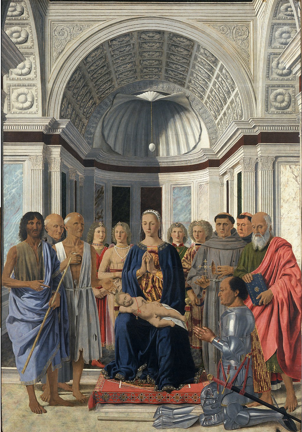 WUNDERKAMMER: of course you already know about this cabinet of wonders that was the favourite guilty pleasures of princes and dukes all over Europe. Who was the trend-setter? It was the typically prognathous Habsburg Emperor Rudolf II , who had withdrawn to his castle in Prague and was curing his melancholy with compulsive collectionism. FLOHPELTZ: It's that soft and luxurious fur worn by Parmigianino's young girl and many other painted ladies. It was used to attract lice and fleas away from the body and head. I confess I might have a jacket with a fur collar... seems much less nice now. 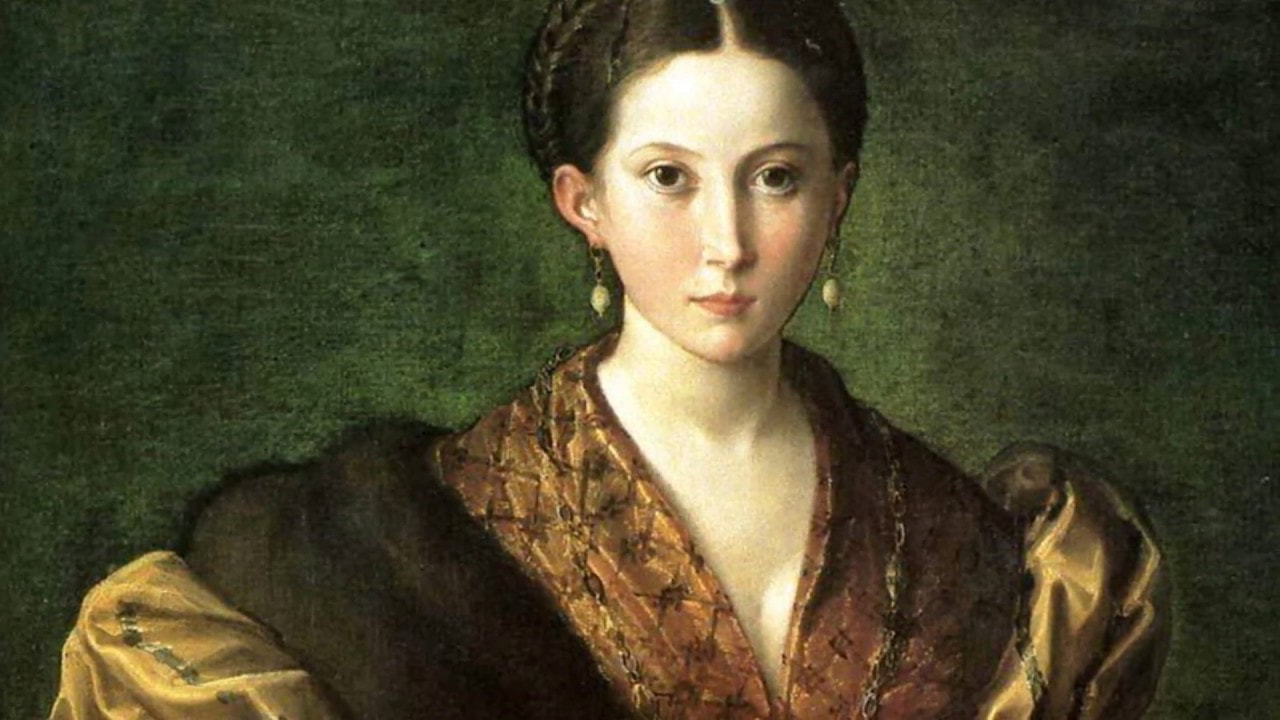 ACCROCHAGE: You are not really still calling it the museum's "display", are you?
DAS LAND WO DIE ZITRONEN BLÜHN: Goethe again, speaking about Italy, the land where lemons bloom. Stick some French in your sentences and you are sophisticated, but try German and you'll be... übercool Oscar Ghiglia, A Forgotten Master 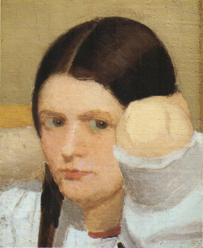 Portrait of Isa, 1908, oil on canvas 25x21 I came across the work of Oscar Ghiglia in a visit to the museum of Villa Mimbelli in Livorno years ago. Since then I never had enough of looking at his work. Oscar Ghiglia, b.1876, came from a very poor family in Tuscany and lived in poverty for most of his life. He was self taught and started painting in his early youth while doing all sorts of odd jobs. In those years he lived in Livorno, a city on the Tuscan coast. Ghiglia was able to bravely overcome his humble origins and his lack of formal education, and became part of the cultural elite of Tuscany. He wrote that his sordid existance of the first years of his life "is when my character was being delineated, in that I always believed best to communicate with objects than people"- as an explanation for his love of the still life genre. In his youth he befriended the painter Llewellyn Lloyd and Modigliani, who was a little younger and from a very different background. Through Modigliani he came in contact with many jewish families to whom he was close and loyal for the rest of his life, including during the hard years of racial persecution. It was not until 1901 that he moved to Florence and started attending the Scuola del Nudo, led by painter Giovanni Fattori, the star painter of the time. Fattori respected him as an artist and they paid each other studio visits, but Ghiglia did not fully belong to his students' group nor ever ascribed to the divisionist painting language that many Tuscan painter were adopting. In Florence he also joined a group of intellectuals that included Papini and Prezzolini, who will eventually form the core of the Futurists. He was well aware of the social and political situation at the time however his art was deliberately apolitic, and he disliked the -isms of that time. He did not share the fascination for modern machines and speed that was at the core of Futurism, and later on openly condemned fascism and war. Another vital meeting of the end of the century was with his wife Isa: her devotion and affection supported him throughout his life providing the serene atmosphere that is so well depicted in his paintings. Ghiglia's artistic breakthrough happend in 1901 when his self portrait was included in the prestigious Esposizione Universale in Venice. In the meantime he was making real progress, studying the old masters preferring Titian and Rembrandt to the Florentines. 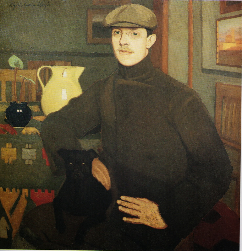 Portrait of Llewlyn LLoyd, oil on canvas 89x88, 1907 His portraits are characterised by a solid perspective structure, immediate but in fact very complex. They never indulge toward sentimentality nor they become flamboyant. With a classical departure point, they are made modern by the simplification of the drawing; all the emotional content is reduced to a precise construction of the image. At the start of his career he mainly painted portraits but in the painting of his friend Lloyd ( above) his interest for still life is starting to appear. In these first years there is no evidence of contacts with European contemporary painting, particularly with artists who had interest in the domestic such as the Nabi or Scandinavian, nor William Nicholson, who were all shown in Venice too. At this stage his development was completely autonomous- although the friendship with Ojetti soon gave him access to the extensive library of this well-known intellectua, and Cezanne's influence can be clearly seen after 1910. 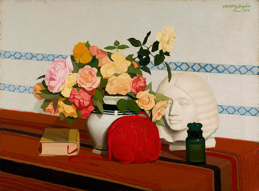 Il Gomitolo Rosso, 1908 Luminous clarity with full-bodied paint perfectly describe the form. 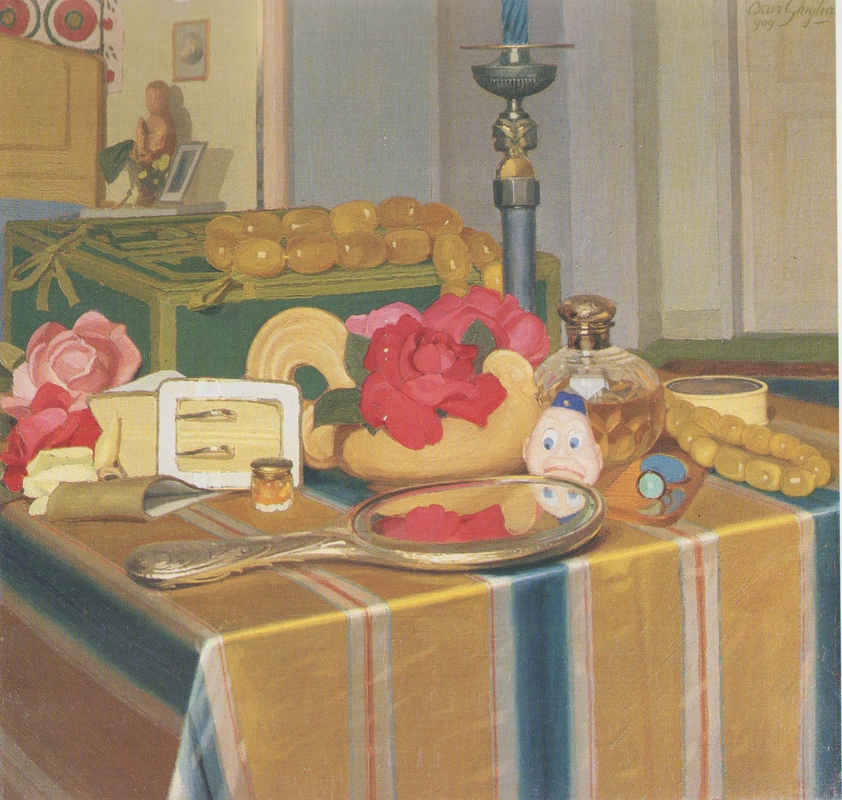 The Mirror, oil on canvas 50x48, 1909 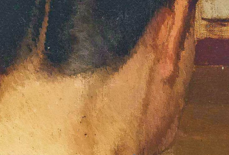 A detail from a painting sold at Christie's in 2011 - he's finally seen Cezanne. 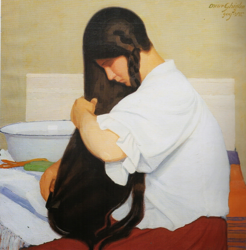 The White Shirt, oil on canvas 21x59, 1909 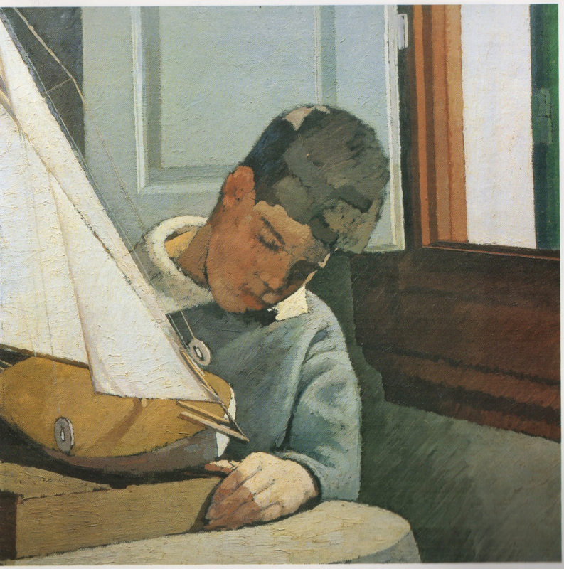 Paulo with the boat, oil on canvas 63x63, In 1914 at the start of WW1 he finds a refuge on the coastal town of Castiglioncello with Isa and their five children. He experiences strong feelings of isolation, as he was seen almost as a bolshevic by the bourgeois holiday makers and far from the warmongering spirit of his frends, the Futurists. Here he will paint some beautiful landscapes that are integral to his work. The format and the subjects recall the Macchiaioli painters but landscape for him is in fact a rational construction. with solid brushwork, the opposite of "optical" impressionism, and an intuition of the surface as the field of chromatic relationships - like a mosaic ( in his own words). 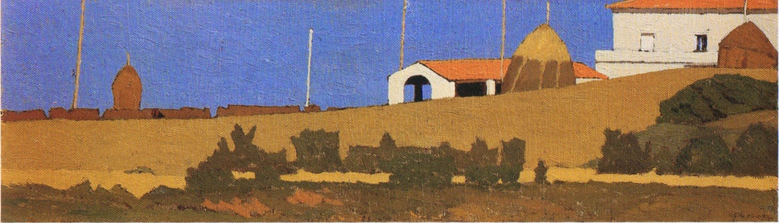 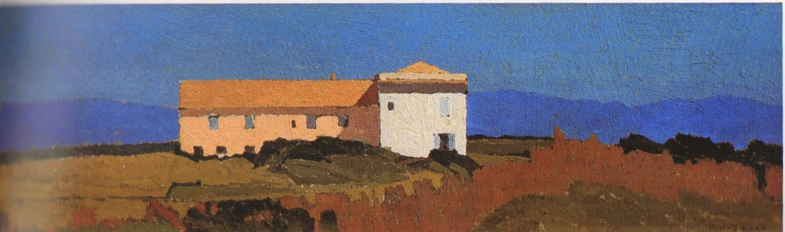 Campagna a Castiglioncello, both 12x39 oil on cardboard, 1914 These remind me of Uglow's landscapes. 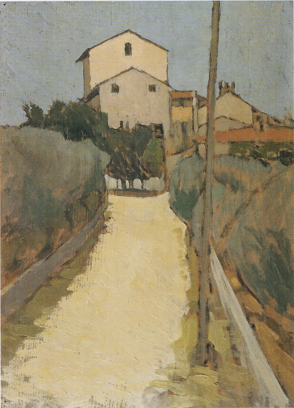 View of Villa d'Ancona a Volognano, oil on panel 39x28.5, 1913/1915. A forerunner of Morandi's landscapes. In Castiglioncello he will also paint still life and beautiful portraits such as Paulo with the Boat, above. After the war he goes back to Florence, where he witnesses with spite the rise of fascism. Figure comes back into his work, particularly the figure in the mirror, an object that will remain a favourite motif for the next decade. This period sees the resolution of his contract with the collector Gustavo Sforni, who had basically acquired the greatest bulk of his production. It was a relationship that helped him out financially for years but might have ultimately damaged the chances of his paintings circulating more widely. Now in his fifties and increasingly isolated also because of his antifascism, he continued to paint magnificently during the 20s and the 30s. 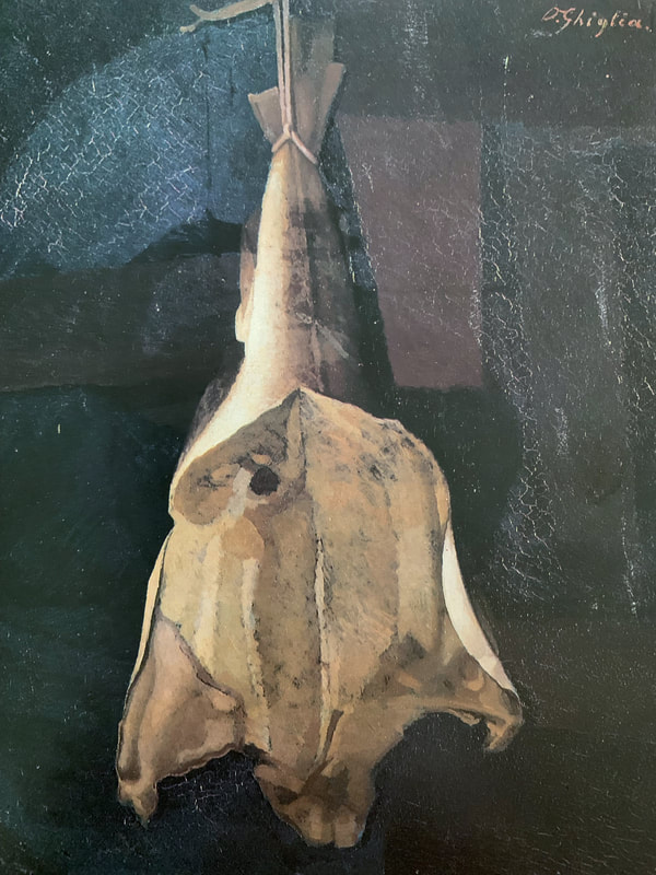 Il Baccala', 1917/1918 Taking on Chardin ? 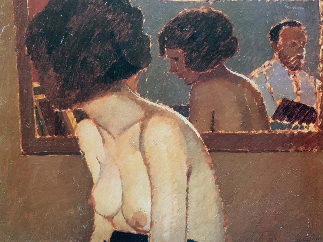 Modella allo Specchio, 1922 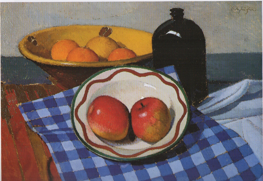 Composition with Checked Cloth, oil on cardboard 35x49, 1923/1925 Cezannian in the way the bowl is tilted, but the shift makes total sense in design and perspective avoiding the ambiguity of planes of the French painter. 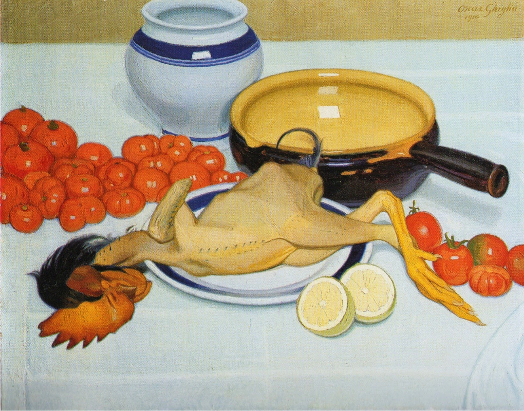 The Chicken, oil on canvas 47x60, 1910 ( compare with still lifes by Felix Vallotton) 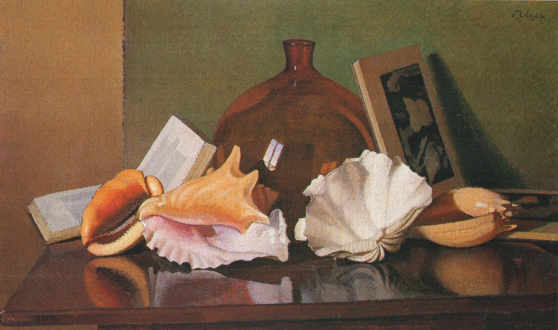 The shells, oil on canvas 55x91, 1925/26 In 1943, while he was an evacuee in the countryside, weakened by sickness, his house, many paintings and all his cast of objects that had appeared in his works were lost in the only allied bombardment of Florence in WW2. Ghiglia died in 1945. 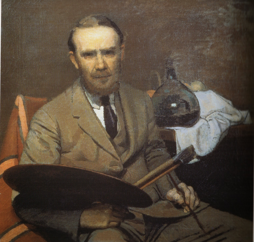 Info gathered from: Oscar Ghiglia, Maestro del Novecento Italiano, published by Farsetti Arte in 1996. LISTEN BELOW FOR THE CORRECT PRONOUNCIATION OF HIS NAME
When I embarked in my recent series of mezzotints featuring plants, I didn’t know that I had some sort of precedent in my family. Through a research recently published by a group of academics ( G. Moggi, B. Biagioli, G. Cellai, L. Fantoni, P. Luzzi, C. Nepi) I’ve learned about an ancient book that is in my family’s library in Florence. The book dates from 1575 and is what’s known as Hortus Impressus, a text that presents a collection of plants 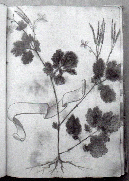 The book was commissioned and annotated by an ancestor of mine, Stefano Rosselli. He was a “speziale”, basically a pharmacist. He had a flourishing bottega in Florence and his ointments and remedies where so famous that he became the Grand Duke Ferdinand’s pharmacist from 1588 to 1595. There are records of him being paid “three scudi a month and a horse”, and preparing antidotes for venoms, but also lip balm, for Cosimo I de’ Medici ( Ferdinand’s father) too. Stefano is also quoted as one of the pharmacists making the ultimate and true version of Theriaca: an ancient “omnimorbia poliremedy”, whose name derives from snake’s venom, that has been prescribed for over eighteen centuries as a potent medicine that could cure a number of diseases. The invention of Theriaca is credited to Mitridate, king of Ponto, and perfected by Andromaco the Elder, personal physician to the emperor Nero. Galeno cites 62 ingredients, that became 74 in Spanish pharmacology. In the 16th century the best Theriaca was made in Venice, where eastern ingredients could be added; these included opium, myrrh, cinnamon, gum Arabic, rhubarb, incense, turpentine and more. Stefano made his own version and was called as an expert consultant over the recipe in favour of the scientist and botanist Ulisse Aldrovandi in a famous dispute (they won) against the guild of physicians in Bologna. 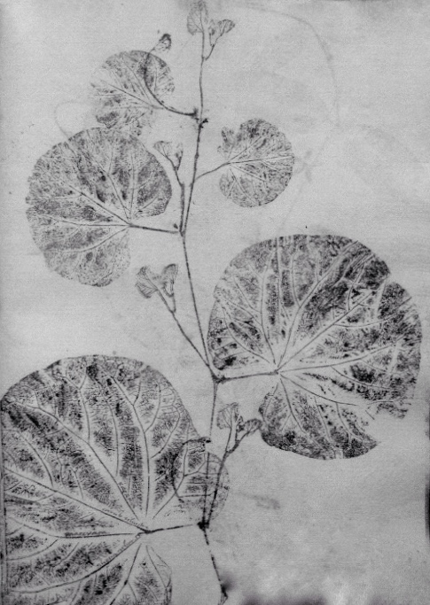 Going back to Stefano, with the money he made from his business he acquired a villa and planted a garden with all the botanic specimens he both personally collected and obtained through his contacts with the main botanists of the time, including Aldrovandi who is one of the fathers of modern botany. Stefano’s interest was no longer only medical, he became a passionate collector. In the Middle Ages botanical texts, compiled to document plants with medicinal properties( called Semplici), were illustrated with painted images (Horti Pincti). At the beginning of the XIV century botanists found a more reliable method by printing the specimens directly onto the pages (Horti Impressi). This practice lasted for almost two centuries before being substituted by collections of dried specimens ( Horti Sicci ). 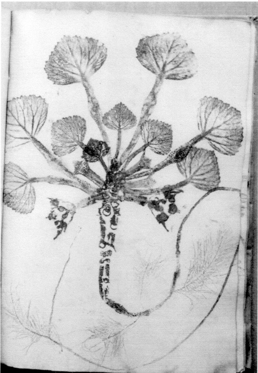 The most well known example of direct impression of a botanical specimen is a sage leaf found in Leonardo’s Codice Atlantico. Of course Leonardo’s enquiring mind was interested in this practice and he describes how a leaf has to be coated with soot from a candle, laid on paper and rubbed so that it produces an accurate image. Nerofumo ( lampblack) is the medium used for Stefano’s herbarium, while other books were made using inks or paints 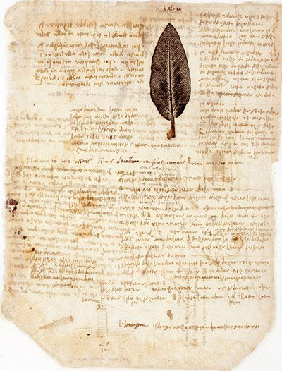 Stefano’s book is printed on paper with a Fabriano watermark. The first pages are made of a long list of plants copied from the famous herbarium of Andrea Cesalpino. It’s as if the list served as guide to then put together his own collection. The list is annotated in Stefano’s handwriting ( “thorny, grows in edges, diverging leaf but succulent, women call it marmeruce”, “maple whose seeds look like holmoak”). The second part, 83 prints, is the actual collection of prints, made of plants that could be found in Tuscany, both on coastal and mountainous areas and others more exotic that most likely came from his garden. Some are arranged on the page in a very matter of fact way, some others end up with an interesting composition, some were even overpainted in watercolour. You can imagine my delight at finding out all these facts after having made plants prints, and I had unknowingly decided to use Fabriano paper for editioning them too ! The book doesn’t really have an artistic value, nor it’s a fundamental scientific text, however I find its amateur’s nature very endearing: it really feels like a personal project that was doggedly pursued despite being obsolete ( in 1575 the Horti Sicci were in use, and the codice Rosselli is the last known example of Hortus Impressus). It speaks about Stefano and his passion, and his tiny handwriting ( way smaller than the main copist) in my eyes betrays the seriousness and thoroughness of his character. Another element that filled me with joy is the amount of meaningful exchanges that Stefano has with his correspondents “abroad” (Italy was still divided in different states at the time). A case of an intellectual whose interests take him beyond national borders: he was eager to exchange and share knowledge with foreigners, and although his main interest lies in autochthonous species he wasn’t afraid of “contaminating” his own garden with alien plants that could increase the diversity and potency of his pharmaceutical concoctions. 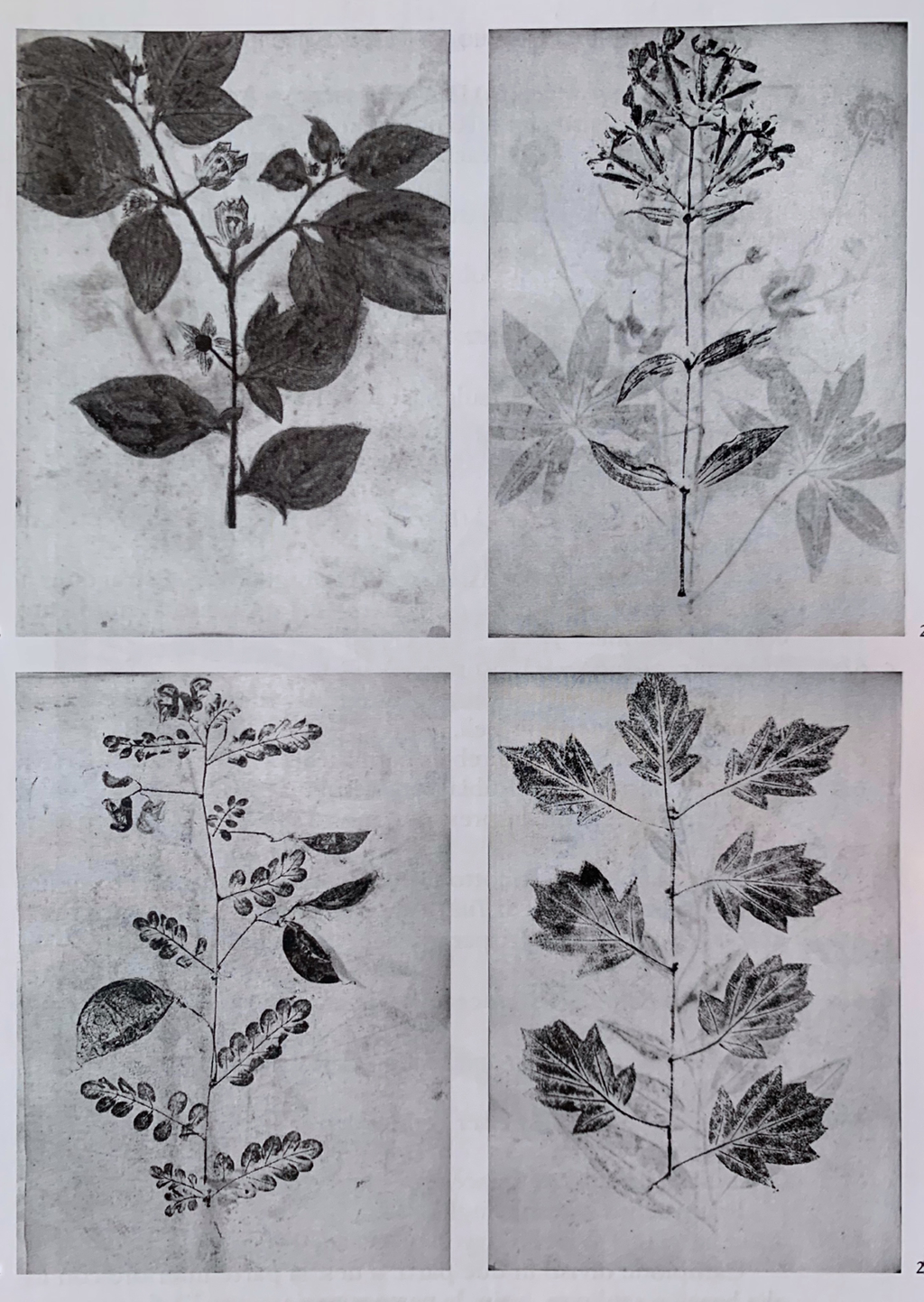 |
Check the list below to see posts on these subjects.Categories
All
AuthorIlaria Rosselli Del Turco is an Italian painter living in London. |
||||||
 RSS Feed
.jpg)